Introduction
The R package bshazard (Rebora, Salim, and Reilly 2014) has been available on CRAN since 2014. It might be useful where there is interest in where smoothed hazard rates cross. When there is excess in one arm early and excess in the other arm late, the time at which (smoothed) hazard rates cross can come well before the time when Kaplan-Meier survival curves cross. The time at which hazard rates cross is probably a more important demarcation for the period of early excess risk than the time at which survival curves cross.
As noted by Rebora, Salim, and Reilly (2014), another alternative is the flexsurv package for comparison (Jackson 2016). The bshazard package has no unit testing included, but we have found the model checking procedure described below adequate to justify the use of the package. This sort of model checking is likely to be recommended regardless of how hazard rates are estimated.
library(bshazard)
library(simtrial)
library(dplyr)
library(survival)
library(ggsurvfit)
# Crossing survival curves example from simtrial
data(ex6_crossing)# Set theme and color scales globally
ggplot2::theme_set(cowplot::theme_cowplot())
# Observable 10 color palette
pal <- c("#EFB118", "#4269D0", "#9498A0")
pal_ctrl <- pal[1]
pal_expt <- pal[2]
pal_gray <- pal[3]
scale_color <- function(...) scale_color_manual(values = pal, ...)
scale_fill <- function(...) scale_fill_manual(values = pal, ...)
options(ggplot2.discrete.colour = scale_color)
options(ggplot2.discrete.fill = scale_fill)Example
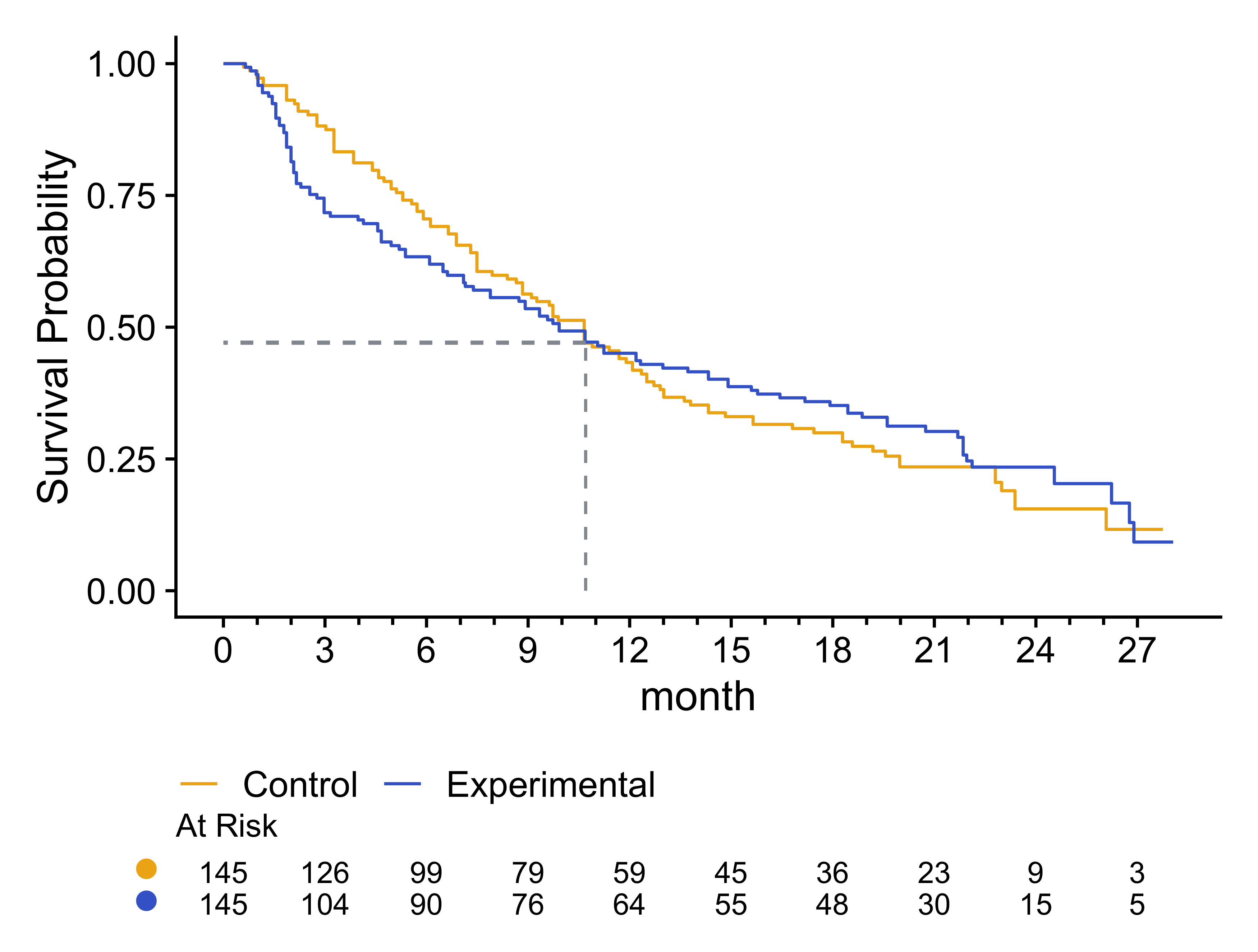
For the following survival curves based on reverse-engineered survival data from the simtrial package, the estimated Kaplan-Meier curves cross between 10 and 11 months. However, we see that the widest gap between the survival curves may have been around 3 months, with the curves converging thereafter. We will evaluate this further using B-spline smoothed hazard rate estimates in the next section.
pl <- survfit2(Surv(month, evntd) ~ trt, data = ex6_crossing)
p <- pl |>
  ggsurvfit(theme = cowplot::theme_cowplot()) +
  add_quantile(x_value = 10.7, linetype = 2, color = pal_gray) +
  scale_x_continuous(
    breaks = seq(0, 27, 3),
    minor_breaks = seq(0, 27, 1)
  ) +
  add_risktable(risktable_stats = "n.risk") +
  add_risktable_strata_symbol(symbol = "\U25CF", size = 16) +
  theme(legend.position = "bottom") +
  scale_color_discrete(labels = c("Control", "Experimental")) +
  guides(x = guide_axis(minor.ticks = TRUE))
p
Figure 1: Kaplan-Meier survival curves for Control and Treatment groups, with risk tables displaying the number at risk over time. A vertical dashed line between 10 and 11 months indicates the point where the survival curves cross.
Smoothed hazard rate estimates
We apply the bshazard package to smooth the hazard rate over time within
each treatment group.
Here, we used the default nk = 31 knots for smoothing.
The bshazard() documentation
suggests a maximum of nk = 40, but higher values can be used
to see behavior induced by the nk parameter.
For instance, increasing to nk = 120 likely will give a much less smooth curve.
Thus, selecting this parameter can be a bit of an art, given the
descriptive nature of the analysis.
fit <- bshazard(
  Surv(month, evntd) ~ 1,
  data = subset(ex6_crossing, trt == 0),
  nk = 31
)
fit2 <- bshazard(
  Surv(month, evntd) ~ 1,
  data = subset(ex6_crossing, trt == 1),
  nk = 31
)
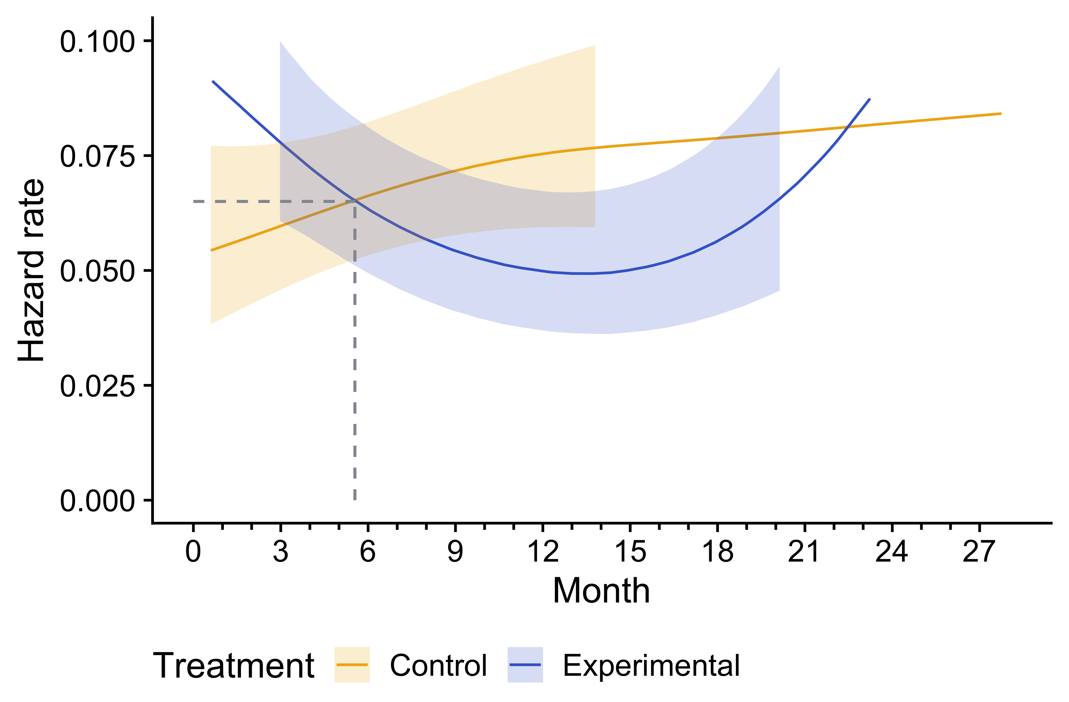
We plot the hazard rates with confidence bands by treatment group.
haz <- bind_rows(
  data.frame(
    Month = fit$time, Hazard = fit$hazard,
    Treatment = "Control",
    lower.ci = fit$lower.ci, upper.ci = fit$upper.ci
  ),
  data.frame(
    Month = fit2$time, Hazard = fit2$hazard,
    Treatment = "Experimental",
    lower.ci = fit2$lower.ci, upper.ci = fit2$upper.ci
  )
)

ggplot(haz, aes(Month)) +
  geom_line(aes(y = Hazard, col = Treatment)) +
  geom_ribbon(
    aes(ymin = lower.ci, ymax = upper.ci, fill = Treatment),
    alpha = 0.2, linetype = 0
  ) +
  scale_x_continuous(
    breaks = seq(0, 27, 3),
    minor_breaks = seq(0, 27, 1)
  ) +
  geom_segment(
    aes(x = 5.55, y = 0, xend = 5.55, yend = 0.065),
    linetype = 2, color = pal_gray, linewidth = 0.5
  ) +
  geom_segment(
    aes(x = 0, y = 0.065, xend = 5.55, yend = 0.065),
    linetype = 2, color = pal_gray, linewidth = 0.5
  ) +
  ylab("Hazard rate") +
  ylim(0, 0.1) +
  theme(legend.position = "bottom") +
  guides(x = guide_axis(minor.ticks = TRUE))
Figure 2: Smoothed hazard rate estimates with 95% confidence intervals for Control and Experimental groups over time. Dashed lines mark the crossing point before 6 months, highlighting where the hazard rates of the two groups intersect.
Compare smoothed to actual survival function
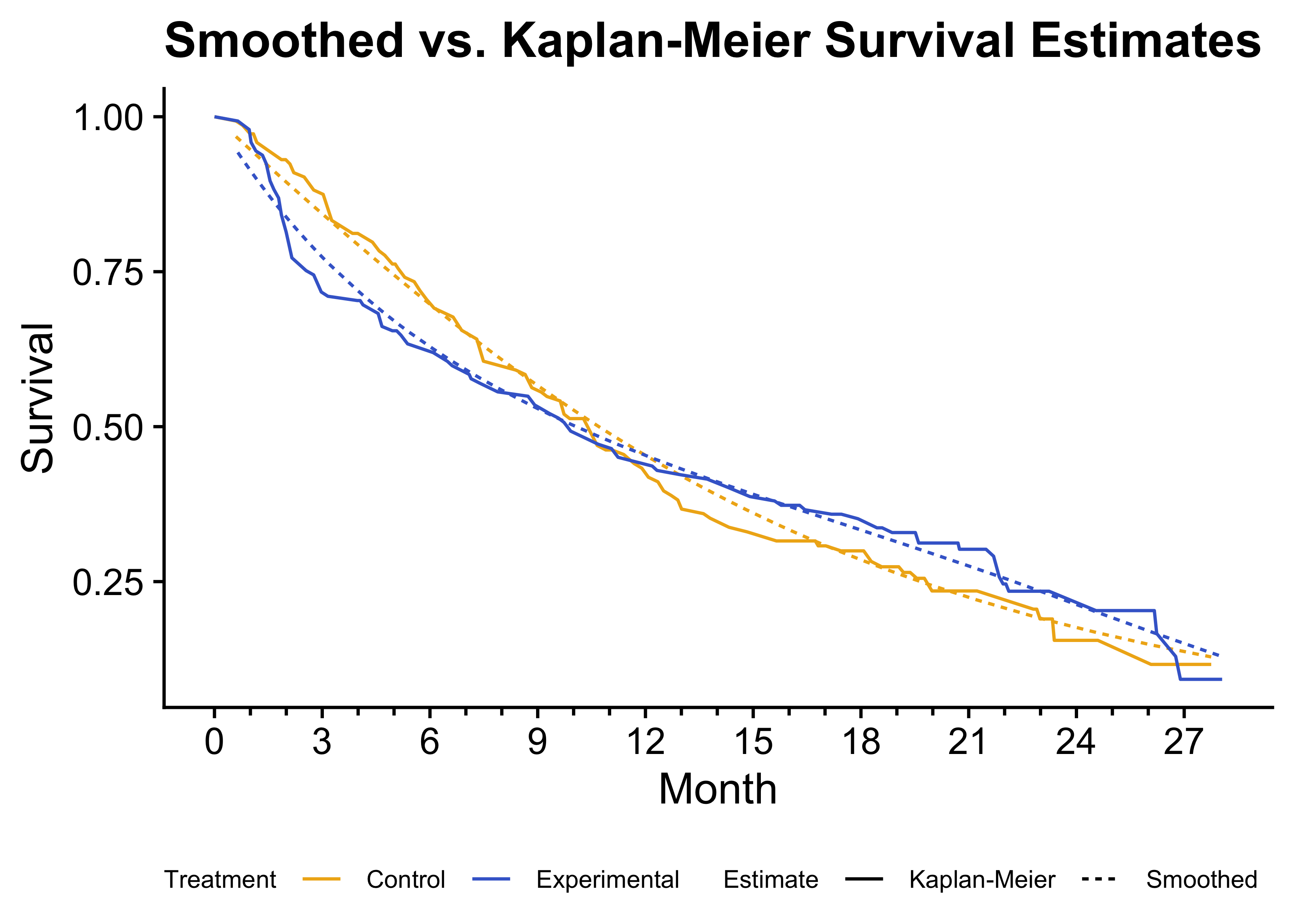
While bshazard has been published (Rebora, Salim, and Reilly 2014), it is relatively new, and it is worth checking the model fit. For this purpose, we transform the smoothed hazard rate estimates into survival curves and compare them to the Kaplan-Meier curves previously estimated. The Kaplan-Meier curves are reproduced accurately by the smoothed estimate for each treatment group. We noted previously that the Kaplan-Meier curves crossed after 10 months for the treatment groups. For hazard rates, we see the crossing of observed curves is before 6 months, suggesting a different interpretation of when an excess risk period ends for the experimental group compared to the control.
# Get a smoothed survival estimate
pl2 <- haz |>
  group_by(Treatment) |>
  mutate(
    CHaz = cumsum((Month - lag(Month, default = 0)) * Hazard),
    Survival = exp(-CHaz), Estimate = "Smoothed"
  ) |>
  select(Survival, Month, Treatment, Estimate)

# Get Kaplan-Meier data from plots
km <- p$data |>
  as.data.frame() |>
  transmute(
    Survival = estimate,
    Month = time,
    Treatment = ifelse(strata == 1, "Experimental", "Control"),
    Estimate = "Kaplan-Meier"
  )

# Combine and plot
ggplot(
  bind_rows(pl2, km),
  aes(x = Month, y = Survival, col = Treatment, lty = Estimate)
) +
  geom_line() +
  scale_x_continuous(
    breaks = seq(0, 27, 3),
    minor_breaks = seq(0, 27, 1)
  ) +
  ylab("Survival") +
  ggtitle("Smoothed vs. Kaplan-Meier Survival Estimates") +
  theme(
    legend.position = "bottom",
    legend.title = element_text(size = 8),
    legend.text = element_text(size = 8)
  ) +
  guides(
    color = guide_legend(order = 1),
    linetype = guide_legend(order = 2),
    x = guide_axis(minor.ticks = TRUE)
  )
Figure 3: Comparison of smoothed survival estimates and Kaplan-Meier survival curves. The smoothed survival curves (dashed lines) closely match the Kaplan-Meier estimates (solid lines), validating the smoothing approach.
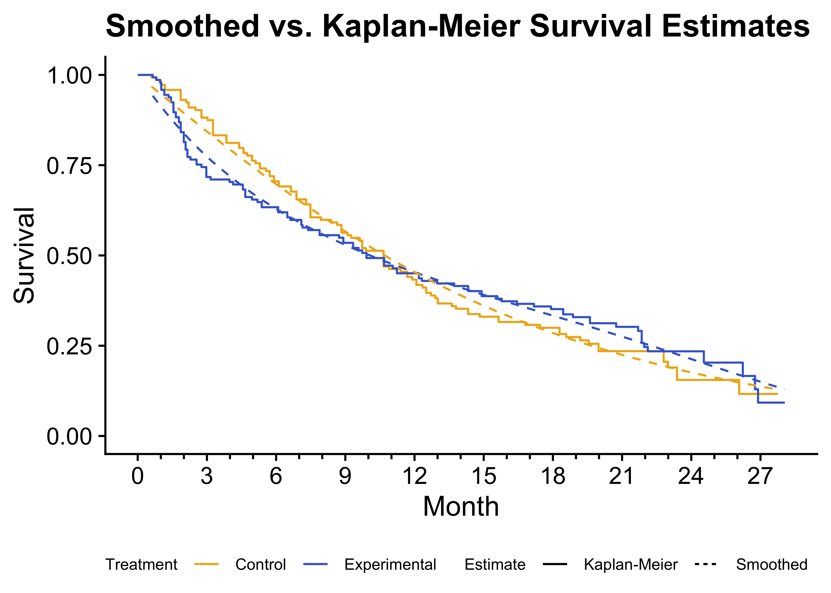
The following example draws the Kaplan-Meier curve as a step function.
pl |>
  ggsurvfit(theme = cowplot::theme_cowplot()) +
  scale_x_continuous(
    breaks = seq(0, 27, 3),
    minor_breaks = seq(0, 27, 1)
  ) +
  geom_line(
    data = pl2 |> filter(Treatment == "Experimental"),
    aes(x = Month, y = Survival),
    col = pal_expt, linetype = "dashed", inherit.aes = FALSE
  ) +
  geom_line(
    data = pl2 |> filter(Treatment == "Control"),
    aes(x = Month, y = Survival),
    col = pal_ctrl, linetype = "dashed", inherit.aes = FALSE
  ) +
  theme(
    legend.position = "bottom",
    legend.title = element_text(size = 8),
    legend.text = element_text(size = 8)
  ) +
  scale_color_discrete(labels = c("Control", "Experimental")) +
  ggtitle("Smoothed vs. Kaplan-Meier Survival Estimates") +
  xlab("Month") +
  ylab("Survival") +
  # Add a legend for linetype
  geom_line(
    data = data.frame(
      x = c(0, 0, 0, 0), y = c(0, 0, 0, 0),
      Estimate = factor(rep(c("Kaplan-Meier", "Smoothed"), 2))
    ),
    aes(x = x, y = y, linetype = Estimate), inherit.aes = FALSE
  ) +
  guides(
    color = guide_legend(title = "Treatment", order = 1),
    linetype = guide_legend(title = "Estimate", order = 2),
    x = guide_axis(minor.ticks = TRUE)
  )
Figure 4: Kaplan-Meier survival curves displayed as step functions (solid lines) with smoothed survival estimates (dashed lines).
Session info
## ═ Session info ═══════════════════════════════════════════════════════════════
## ─ Packages ───────────────────────────────────────────────────────────────────
##  package   * version date (UTC) lib source
##  bshazard  * 1.2     2024-05-12 []  CRAN (R 4.4.0)
##  dplyr     * 1.1.4   2023-11-17 []  CRAN (R 4.4.0)
##  Epi       * 2.55    2024-09-10 []  CRAN (R 4.4.1)
##  ggplot2   * 3.5.1   2024-04-23 []  CRAN (R 4.4.0)
##  ggsurvfit * 1.1.0   2024-05-08 []  CRAN (R 4.4.0)
##  simtrial  * 0.4.1   2024-05-03 []  CRAN (R 4.4.0)
##  survival  * 3.7-0   2024-06-05 []  CRAN (R 4.4.0)
##
##
## ──────────────────────────────────────────────────────────────────────────────