3 Binary and continuous endpoints
We show sample size calculation for binary and continuous endpoints. Specifically, we use asymptotic approximations to the binomial and normal distributions, respectively.
3.1 Binomial outcomes
3.1.1 What is a binary outcome?
An outcome where each patient either succeeds or fails at some underlying probability level is a binary outcome. For instance, if a cancer patient has least a 30% reduction in the sum of the longest diameters of target tumor lesions compared to baseline they are said to have an objective response if they have no new lesions or other signs of progression. We assume the number of patients having an objective response in a treatment group follows a binomial distribution. Even though the actual probability may vary from patient to patient, for the combined patients in a treatment group the binomial approximation can be useful. In a two-arm clinical trial we could compare treatment groups by the difference in observed proportions with objective responses. A higher response rate in the experimental treatment group compared to the control group indicates better treatment outcomes. For instance, in the MONALEESA-2 trial (Hortobagyi et al. 2016), the overall response rate (ORR) with ribociclib + letrozole was 42.5% (136/334) compared to 28.7% (92/334) with placebo + letrozole. In this case, the sample size was 668 (334 per group).
Alternatively, we consider The CAPTURE Investigators (1997) study of patients with unstable angina undergoing percutaneous transluminal coronary angioplasty (PTCA). The primary endpoint was a composite of death, myocardial infarction and repeat urgent coronary intervention within 30 days. The assumed underlying failure rate for the control group was 15% and the trial was powered to detect a reduction in the experimental treatment group to 10%. In this case, a lower failure rate in the experimental group indicates better treatment outcomes.
The basic method for computing the fixed sample size for superiority was developed by Fleiss et al. (1980), but is applied here without the continuity correction as recommended by Gordon and Watson (1996). This method was extended to non-inferiority trials by Farrington and Manning (1990). Extending to group sequential design uses standard sample size inflation methods summarized by Jennison and Turnbull (2000) depending on the specification of interim bounds.
3.1.2 Input
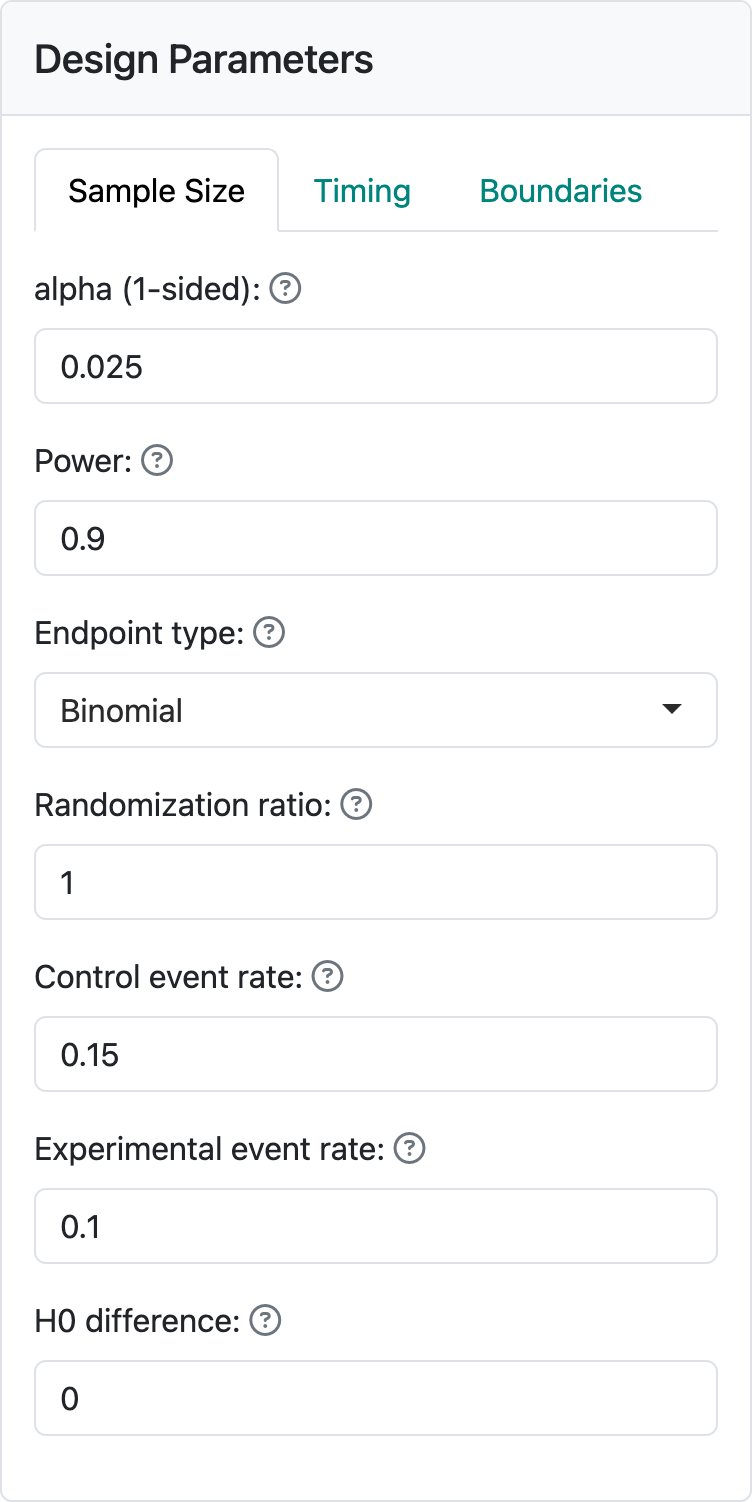
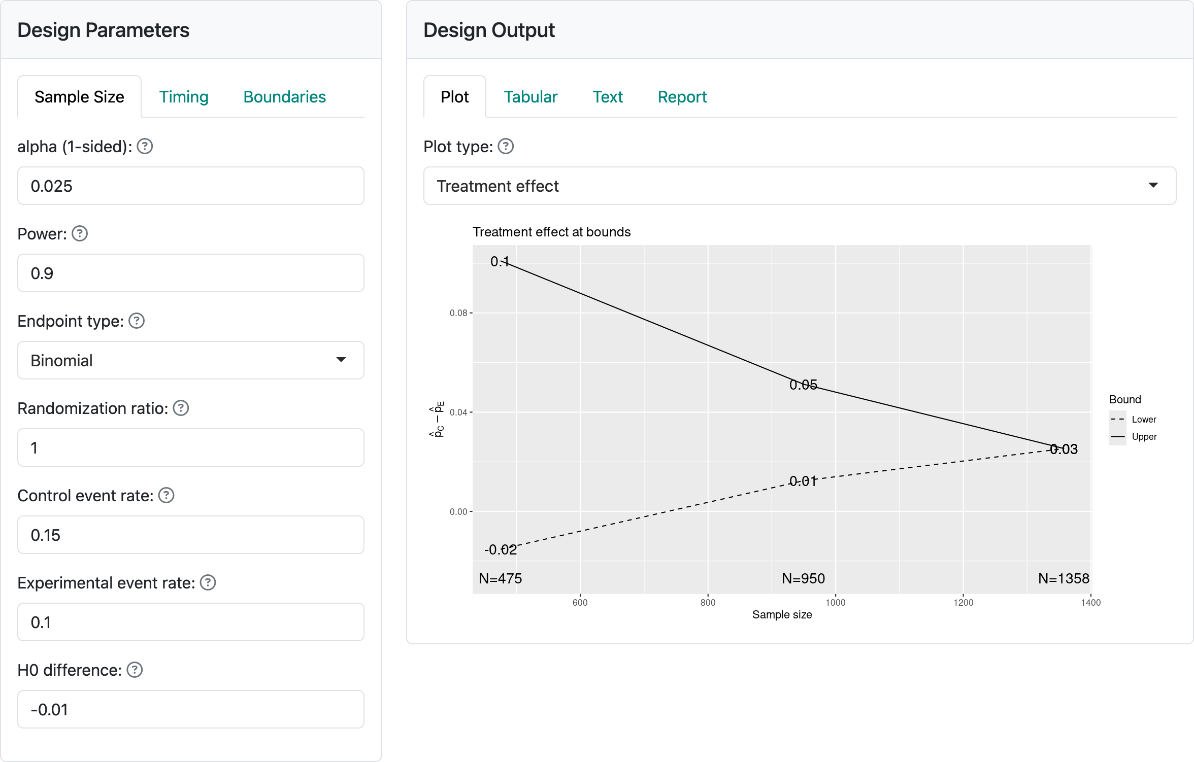
Figure 3.1 shows the input values for a trial with a binomial distribution for the study outcome. The “alpha” and “Power” controls remain unchanged from the previous chapter. We see the “Randomization ratio” which specifies the number of experimental group patients randomized relative to control patients; this will most often be 1, specifying equal randomization between treatment groups. The next two controls specify event rates, either the success or failure rate for each treatment group.
The “H0 difference” control will normally remain as 0 as this specifies that you wish to demonstrate superiority of the experimental group compared to control. If evaluating failure rates and “H0 difference” were \(< 0\), you would be specifying a non-inferiority hypothesis, which we will discuss shortly. For the case shown here we are looking to power the trial to lower the failure rate from 15% in the control group to 10% in the experimental group.
3.1.3 Output
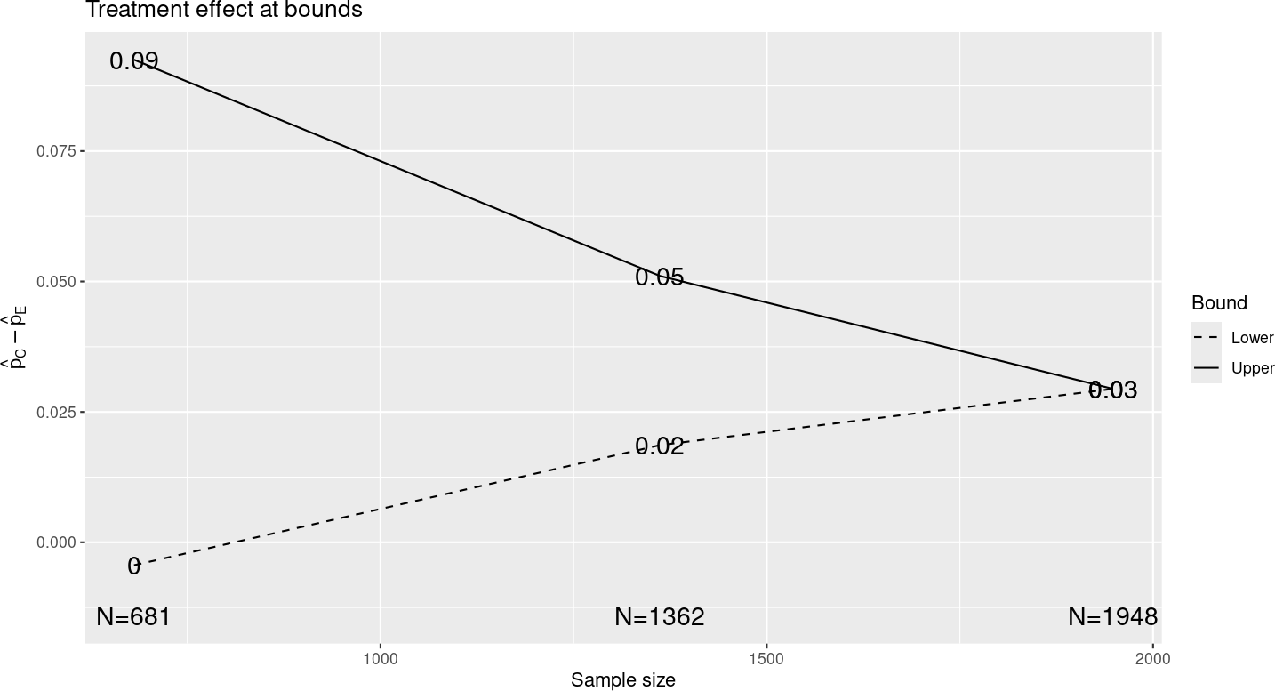
Assuming you have left other inputs unchanged from the previous chapter, and you select the “Treatment effect” plot, you should see the plot in Figure 3.2. This has “the same shape” as the treatment effect in the previous chapter, but the x- and y-axes have been re-scaled, indicating approximate differences in observed event rates at the study bounds for each analysis with a proportionately larger sample size than before. Note that if you change the experimental rate to 0.05 and control to 0.1, the sample size changes, but the treatment differences at bounds remain unchanged if you have not rounded sample size. If you look at the “Tabular” output tab, it will appear largely similar to the previous chapter, again with proportionate alterations in treatment effect and sample size, but not other characteristics.
3.1.4 Updating a binomial design at time of analysis
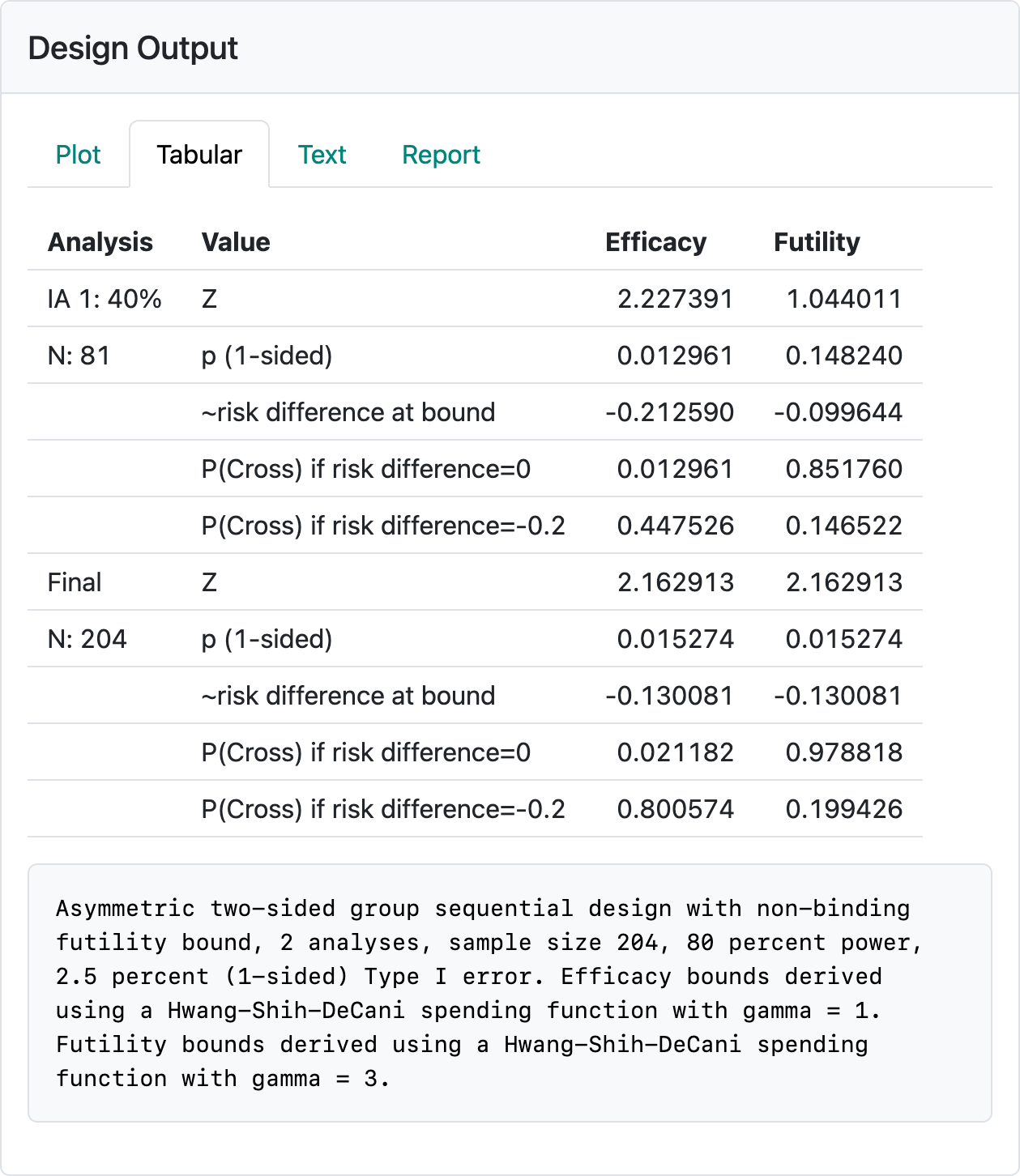
Select the “Update” tab and change the sample size at analyses from the continuous values to 660, 1400 and 1900. The second interim analysis has larger than planned sample sizes (over-running) and the final analysis has a smaller than planned sample size (under-running). Such deviations can happen if cutoffs for analysis are planned based on time rather than sample size to facilitate finalizing data or other logistics related to trial operations, although the final analysis example with 1900 vs. 1948 planned is extreme and used here for learning purposes. You should see the output shown in Figure 3.3.
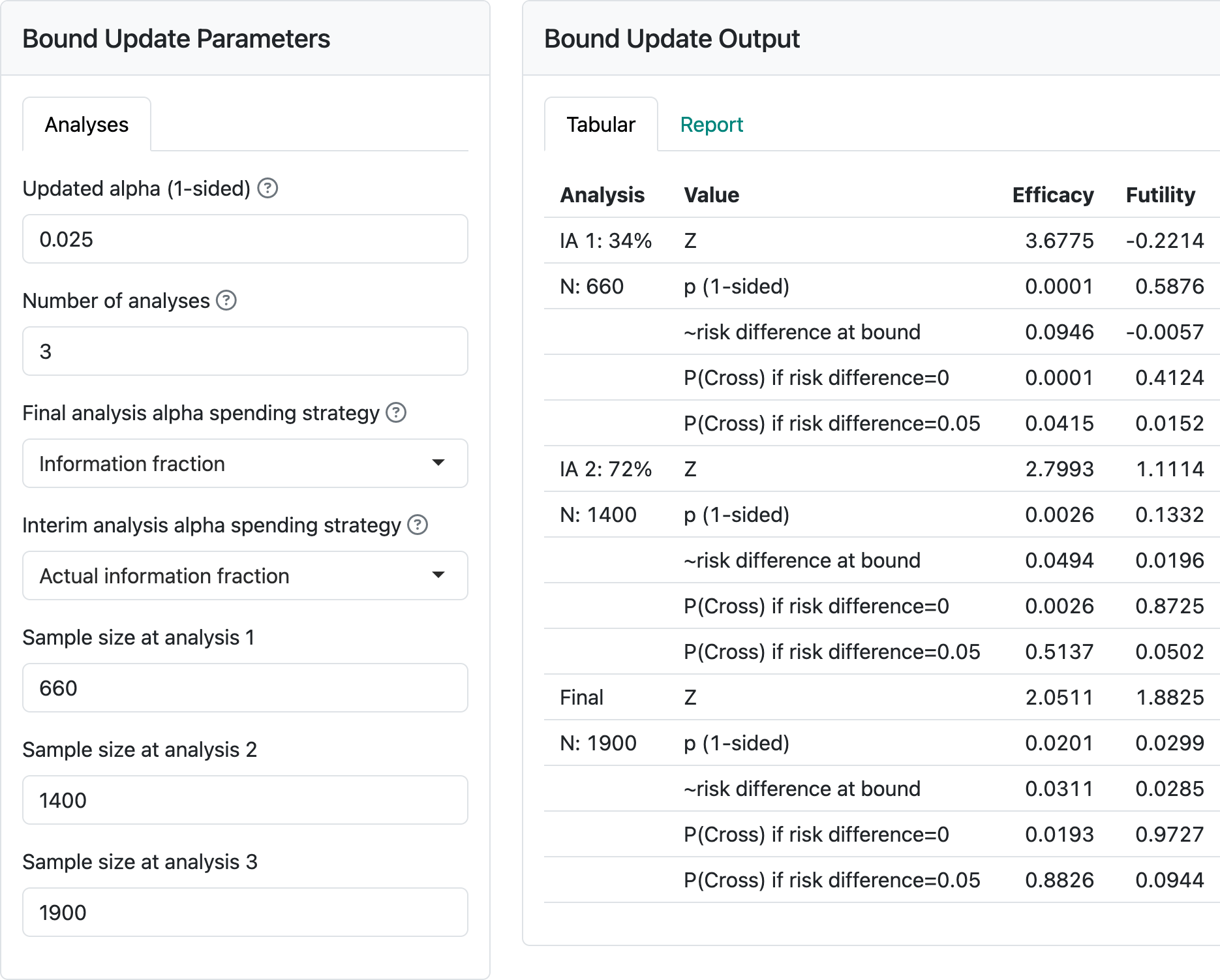
Now change the controls on the left so that under “Final analysis spending strategy” we specify “Full alpha”. You will see that the final analysis nominal \(p\)-value cutoff changes from \(0.0201\) to \(0.0247.\) Now, if we further change the “Interim analysis alpha spending strategy” control to “Minimum of planned and actual information fraction”, the final nominal \(p\)-value is further relaxed to \(p=0.0248\). Note that this is at the cost of the second interim \(p\)-value to cross bounds being more stringent (\(0.0022\) vs \(0.0026\)). It would be prudent to pre-specify how spending will be performed if you may wish to apply either of the above strategies. Ensuring the full \(\alpha\) is spent at the final analysis is particularly valuable. Changing to “Minimum of planned and actual information fraction” at interim analyses may or may not be desirable, depending on the trial under consideration.
3.1.5 Non-inferiority
Figure 3.4 shows input and output when we change the “H0 difference” to \(-0.01\). This means we only need to reject the null hypothesis that the experimental group failure rate is no more than 0.01 worse than control. You can see that the sample size is 30% less than for superiority (H0 difference equal to 0); this is because we have made what we need to demonstrate less stringent. The observed treatment effect required to cross the final bound has been reduced. The shape of the treatment effect plot has, again, not changed. If you look at \(Z\)-values for the boundaries, these have also not changed; note, however, that the way a \(Z\)-statistic is computed would be different since you are testing a different null hypothesis. See Farrington and Manning (1990) or the documentation for the function gsDesign::testBinomial().
3.1.6 Binomial design for response rate
We briefly consider a potential phase 2 design for response rate to illustrate:
- Using response rate rather than failure rate for design in the interface.
- The potential for establishing futility or early proof-of-concept with aggressive interim bounds.
The above design is saved in the file binomial-orr-design.rds. You may wish to re-create it by reading the above and seeing if you can reproduce the design (Figure 3.5). The control and experimental response rates used were 0.15 and 0.35, respectively. The efficacy bounds approximate an aggressive Pocock bound (Pocock 1977) that would normally not be used in a Phase 3 design, but may be useful for demonstrating an early proof-of-concept in a Phase 2 study. In this case, a pause in enrollment or limiting enrollment until the interim has been performed may be a way to limit early investment in the study. The interim efficacy bound establishing efficacy (i.e., proof-of-concept to finish the Phase 2 trial) with a ~10% improvement in response rate at the futility bound or establishing an early go to Phase 3 with a ~20% improvement in response rate can enable early decisions to 1) stop further investment (cross futility bound), 2) accelerate further investment (cross efficacy bound), or 3) finish Phase 2 prior to further investment (cross neither efficacy nor futility bound). If you check in the “Text” tab you will note that a fixed design with no interim and the same power and Type I error can be achieved with a sample size of \(N=146\). If you change to a binding futility bound, the sample size for the group sequential design can be lowered from 204 to 190. All of this is meant as food for thought when you design a trial; final selection of a design will be based on many considerations.
3.2 Normal endpoints
3.2.1 Normal outcomes
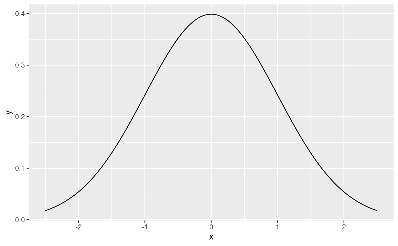
A normal endpoint refers to an outcome where each patient has an outcome that is distributed according to a bell-shaped normal distribution (Figure 3.6). In many cases, this can be extended to non-normal numbers where the sample mean would follow a normal distribution, a common instance according to the central limit theorem.
This could be a measure such as change in cholesterol level before and after being treated on study. While the methods here formally assume the variance is known, this should not be a problem for moderate or large sample sizes (Snedecor and Cochran 1989).
3.2.2 Input
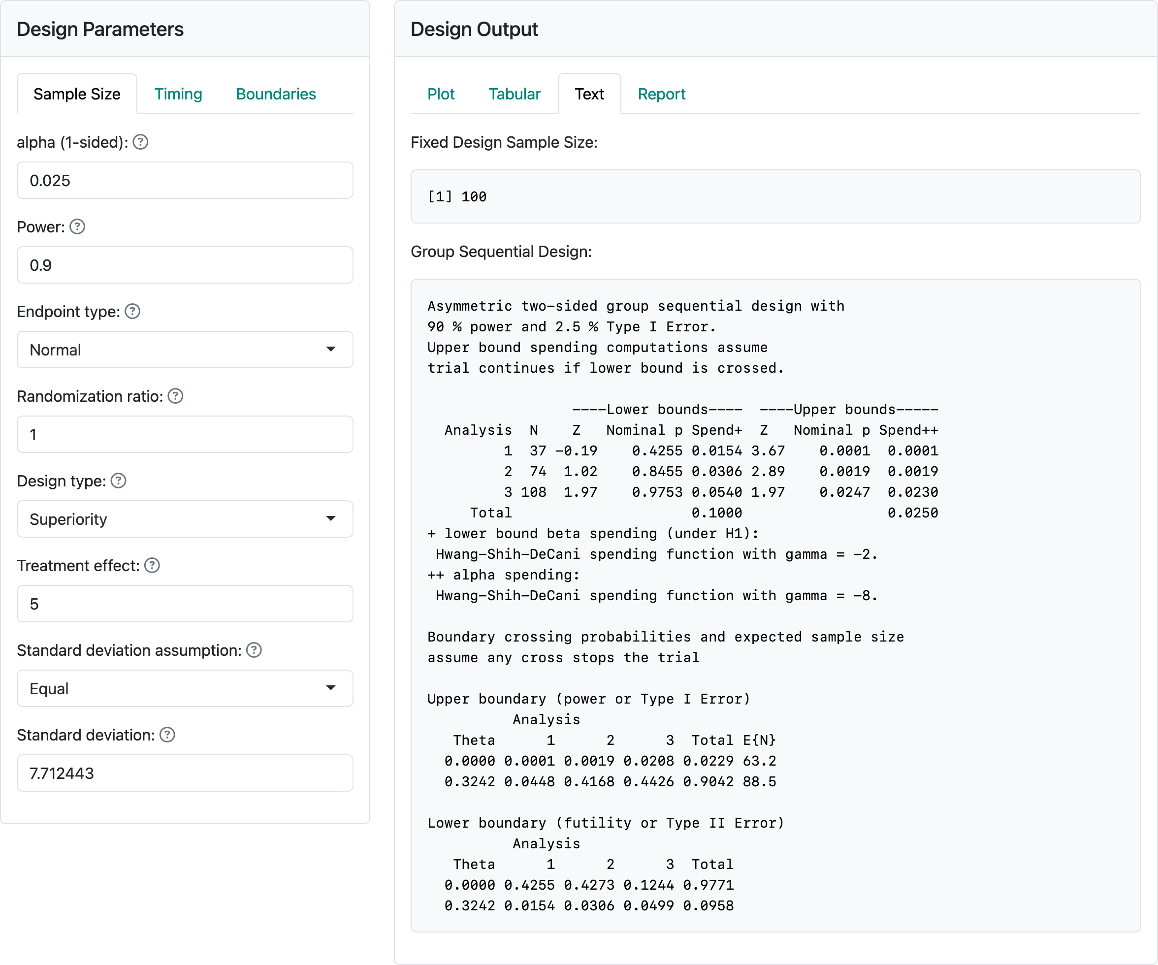
Figure 3.7 shows the input values for a trial with a normal distribution for the study outcome. We have selected “Normal” for “Endpoint type.” The “alpha”, “Power” and “Randomization ratio” controls remain unchanged from the previous section. The next control specifies the difference in means for the outcome in the experimental group compared to the control group. We have selected “Superiority” to test for superiority, and we have specified equal standard deviations in the two treatment groups. Try selecting unequal to see how the controls change. In this case, we select equal standard deviations with a value of 7.712443.
Examining the output panel, we have selected the “Text” tab. At the top, we see a fixed design sample size of 100. This is the same as the fixed design sample size we chose in our example with user-defined sample size. Seeing the fixed design sample size may be the primary reason for selecting the “Text” output tab. Generally, the “Text” tab has similar information seen elsewhere in a different format. If you look at other output tabs, they will provide the same output we had previously for the user-defined sample size example. This is because we have, in both cases, \(\delta = 5\), a fixed design sample size of 100, the same power and Type I error, and the same spending functions and interim analysis timing to define interim and final analysis boundaries. That is, as long as nothing else changes, two designs based on a common fixed design sample size result in an identical group sequential design. In addition, if the treatment effect \(\delta\) for which each design is powered is the same then the approximate treatment effects required to cross each bound will also be the same for the two designs.