2 Your first design
2.1 Overview
In this chapter, you will quickly learn how to initiate the group sequential design web interface, edit input parameters specifying a group sequential design and view tables, text, and plots summarizing the design. We also demonstrate how to view, save, and re-use code for your design. Finally, we show how to access background on the gsDesign web interface as well as demonstration videos.
2.1.1 Starting the web interface
The gsDesign web interface is currently hosted at
https://rinpharma.shinyapps.io/gsdesign/
in the cloud provided by Posit Software, PBC. You can access the application using a modern web browser on your computer, tablet, or smartphone. The interface is responsive and will adapt to the device you use. In case the primary URL is not accessible, additional mirrors of the app are available from https://keaven.github.io/software/.
It is important to note that web applications hosted on shinyapps.io have a default behavior. If you opened the web interface and remain inactive for more than 15 minutes, the session will be disconnected automatically and the page will partially gray-out. At this point, you will lose your work if you have not saved it. Thus, saving your design frequently is a good idea.
When accessing the web interface from networks with restrictive conditions, such as behind a VPN or firewall, you could encounter issues with the XMLHttpRequest (XHR) connection. These issues can appear as the web interface not rendering properly or the inability to download files as expected. In such cases, connecting from a different network may resolve the problem.
2.1.2 Overall layout
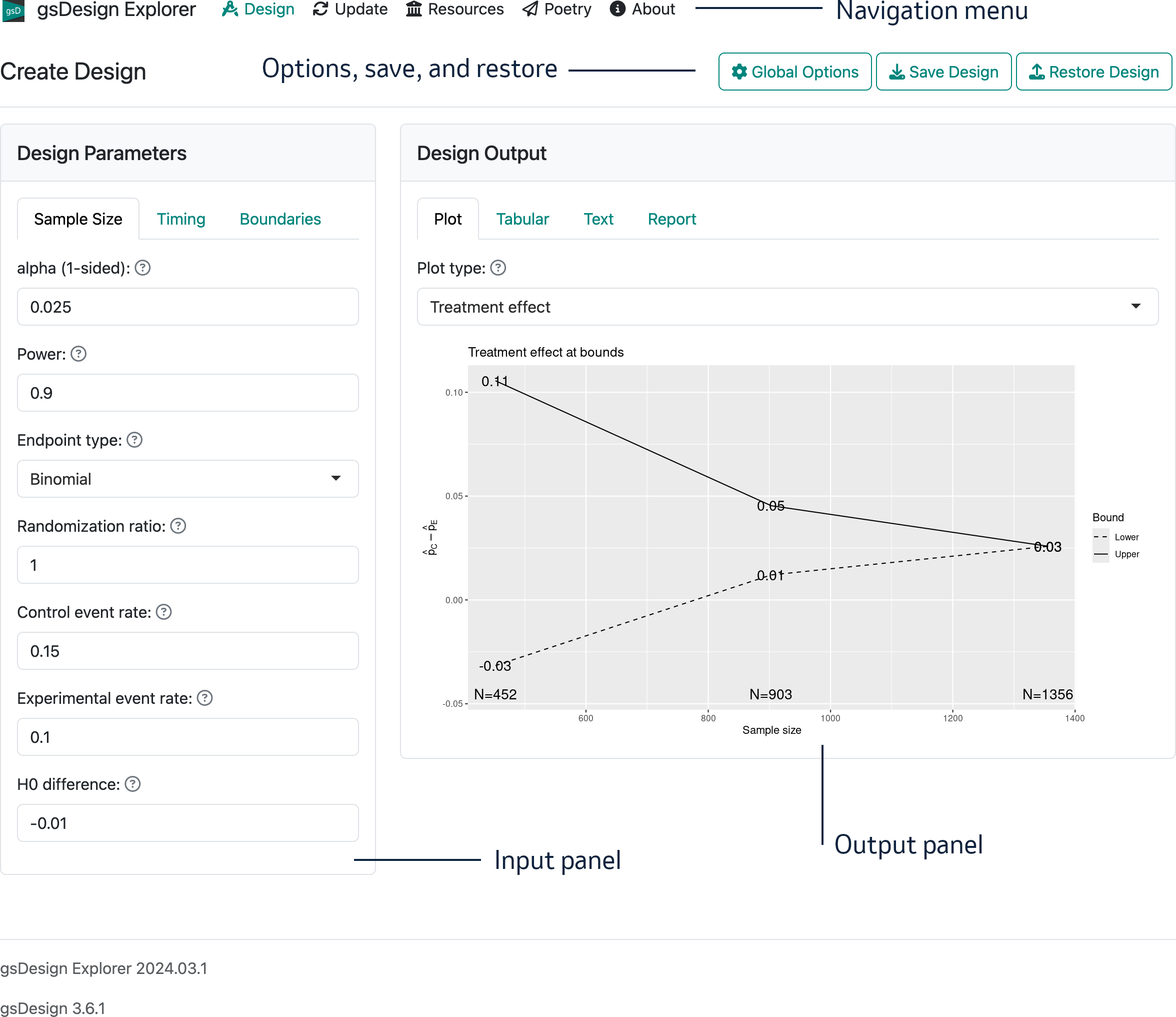
The interface opens with the “Create Design” page that we will work with in this chapter. The overall layout of the opening page on a computer browser is shown in Figure 2.1. Note that in the interface there is a “?” next to each control; if you hover over this, you get a brief description of the control.
There are five regions on this interface:
- In the top-left, you see the branding “gsDesign Explorer” and a navigation menu (“Design”, “Update”, “Resources”, “Poetry”, “About”) that will take you to different interface pages.
- In the top-right, there is a control “Global Options” that controls output format, toggles integer vs. continuous sample, and provides controls to save and restore designs.
- The main left panel is for input of design parameters.
- The main right panel is for displaying various types of output.
- In the page footer you can see the application name and the version number of both the interface and the underlying gsDesign package.
The input panel on the left with tabs labelled “Sample size”, “Timing”, and “Boundaries” is used to control design parameters. The output panel has tabs labelled “Plot”, “Tabular”, “Text”, and “Report”. The output tabs allow you to view characteristics of a design in different ways. In the “Report” tab, you can view and copy code that can be saved or used in R to reproduce a design; you can produce an HTML file with the report or save an R Markdown file locally, so you can edit and customize the report.
2.2 The input panel
The input panel is on the left of the web interface with the following 3 tabs to specify design parameters:
- Sample size tab
- Timing tab
- Boundaries tab
2.2.1 Sample size tab
The sample size tab can be used to set design parameters for a fixed sample size design that is extended to a group sequential design by setting design controls in the timing and boundaries tabs. Type I error in the Sample Size tab is always one-sided; this tab also enables specification of design power and the endpoint type.
For your first design, leave the default values of 0.025 for 2.5% one-sided Type I error and 0.9 for 90% power.
Depending on the endpoint type, corresponding controls will be available to specify needed parameters. For this first design, we begin by selecting the endpoint type “User”. You will see Figure 2.2 in your input panel.
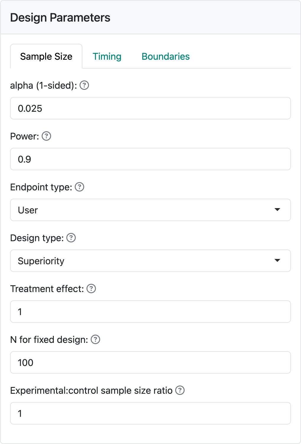
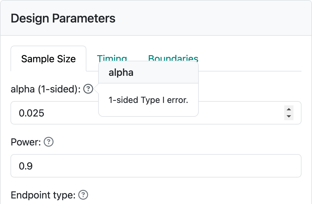
Below “Endpoint type” you see three input controls. “Design type” allows you to select between “Superiority” and “Non-inferiority” designs. We will come back to non-inferiority designs in other chapters covering each endpoint type. “Treatment effect” is a value of a parameter that quantifies the treatment benefit that you wish to power the trial for; for example, a difference in blood pressure response to a control drug versus an experimental drug. Using this example, let’s say that we wish to make the sample size large enough so that if the experimental drug improves blood pressure, on average, by 5 mm more than the control drug we have a “high chance” that a statistical test will demonstrate this. “High chance”, in this case, is set at 0.9 (or 90%) in the “Power” control. We also want to keep the chance to have the same statistical test show a benefit if the experimental drug provides no better blood pressure lowering than control to have the same statistical test show a benefit; this is set to 0.025, (or 2.5%) in the “alpha (1-sided)” control. “alpha” is also known as Type I error, which you can see by hovering on the “?” to the right of “alpha (1-sided)” (Figure 2.3).
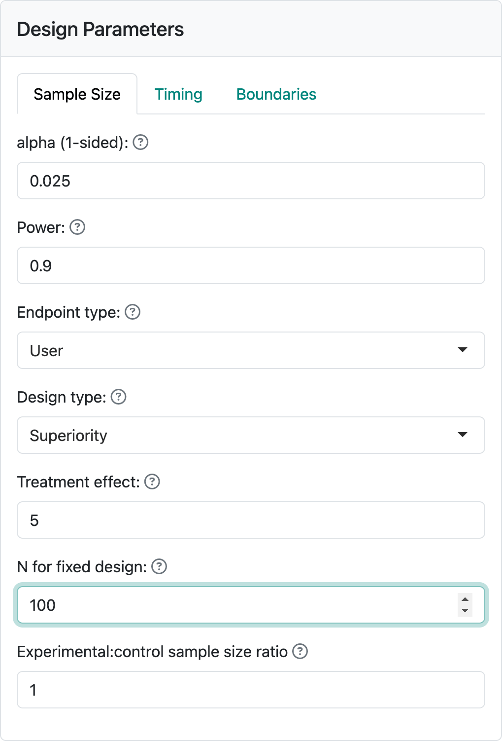
Most of the time you may have the interface compute a sample size for a fixed design for you. In this case, we assume you will use other software to find the sample size for a fixed design with no interim analyses. Assume this computation produces a sample size of 100. Enter this in “N for fixed design”. Your input panel should now appear as in Figure 2.4.
2.2.2 Timing tab
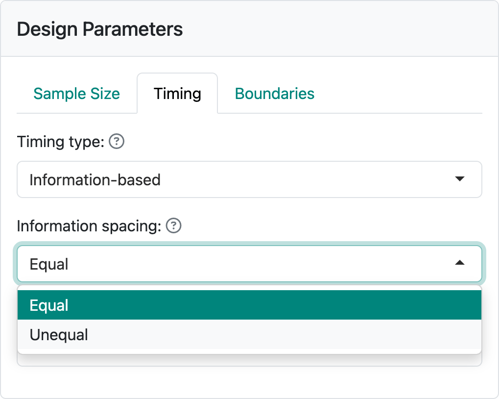
Now we are ready to add interim analyses by selecting the “Timing” tab. You can choose spacing between analyses that is “Equal” or “Unequal” in the “Information spacing” control (Figure 2.5).
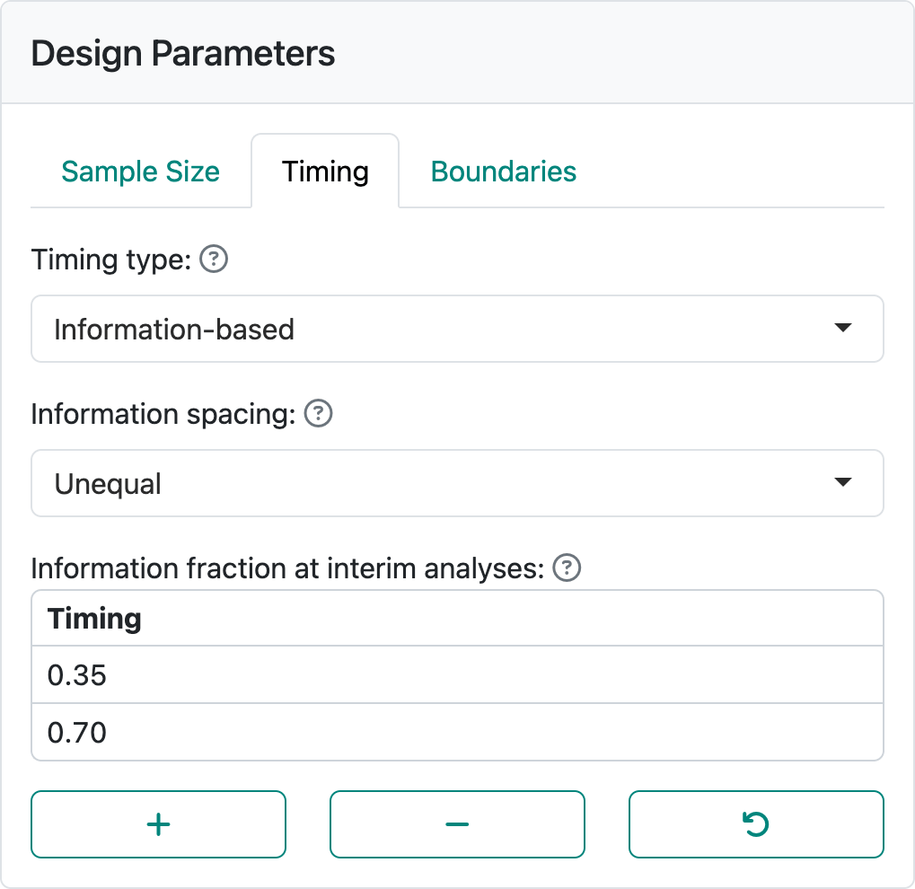
The default is equal spacing with two interim analyses. Selecting “Unequal” spacing and setting to interim analyses after 35% and 70% of the data are available as shown in Figure 2.6. Since it often takes a while to collect data, more patients may enroll while you are preparing for an interim analysis.
2.2.3 Boundaries tab
Finally, we select the “Boundaries” tab where there is a wide variety of options available. Using the “Testing” control, the available bounds you can select between bounds are shown in Figure 2.7.
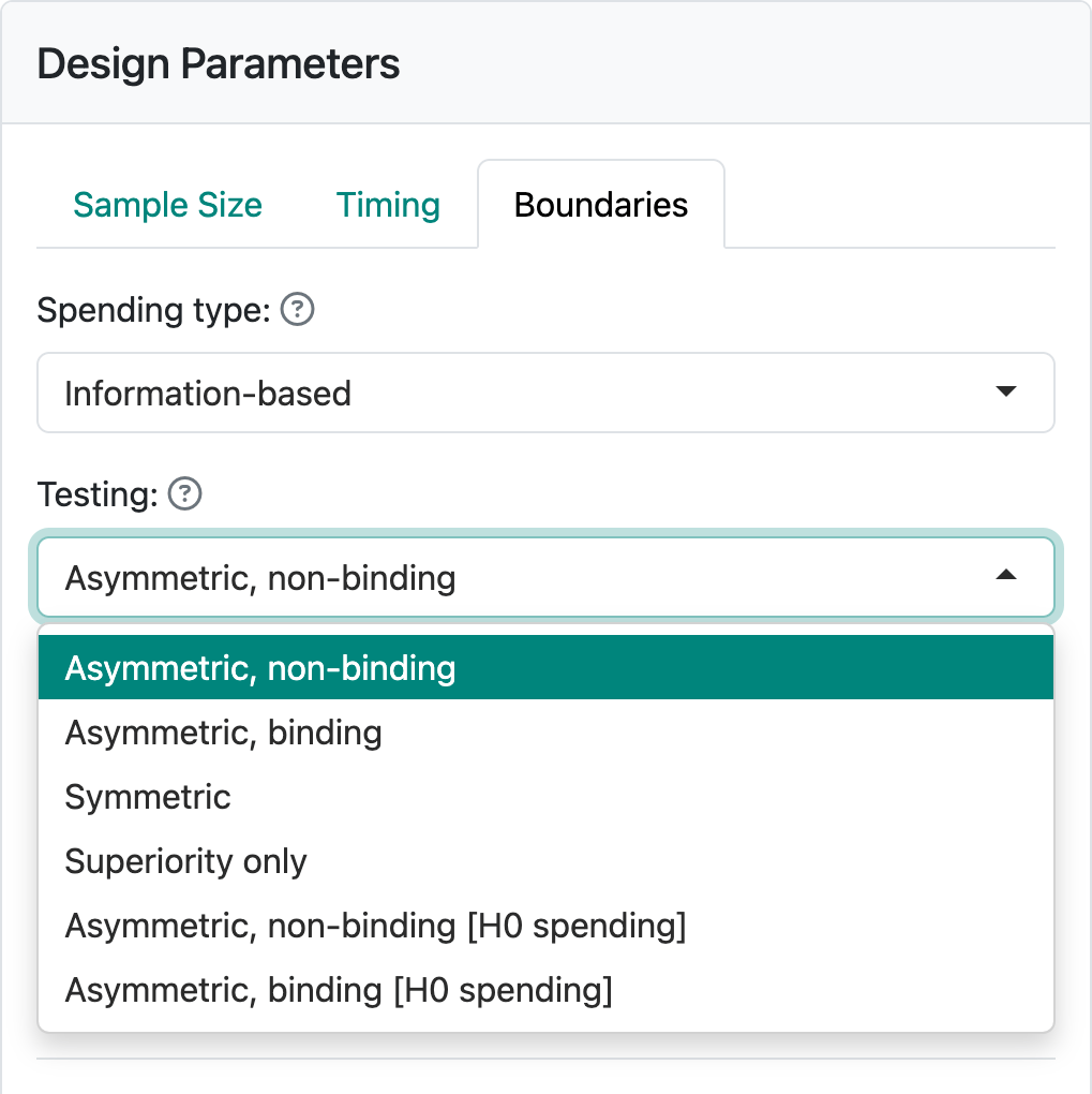
For now, we will stick with the default of “Asymmetric, non-binding”, a good option for many trials where a new drug is compared to standard therapy or placebo control arm. For other options, see Chapter 7.
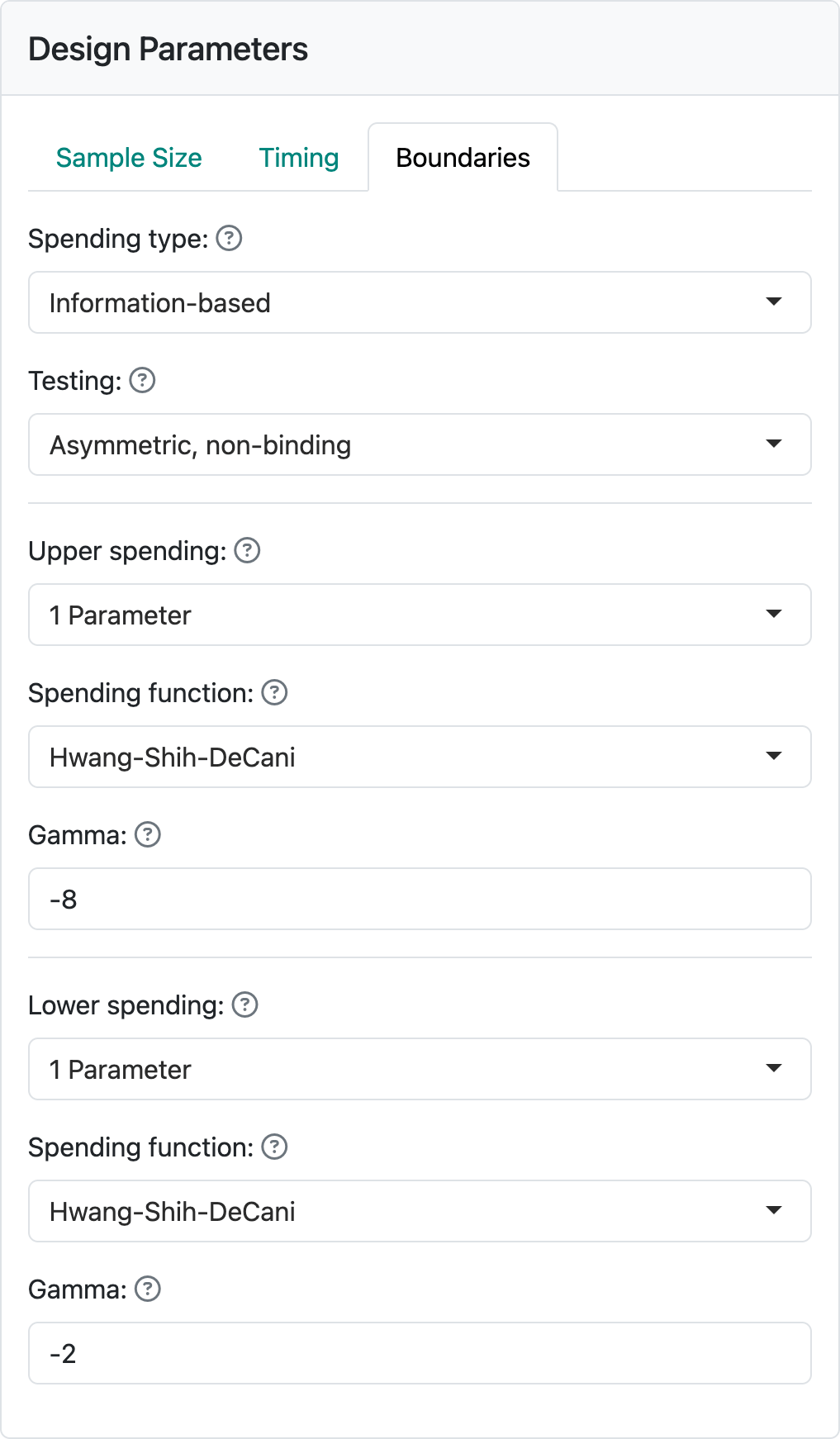
The “Upper spending” and “Lower spending” controls allow a wide variety of bounds to be selected for a design. For this example, setting both “Upper spending” and “Lower-spending” to “1-parameter” and leaving the “Gamma” parameters as defaults (Figure 2.8), you will obtain the output panel displayed on the right of the web interface as shown in Figure 2.9. The defaults shown here are reasonably conservative and a good starting point.
2.3 The output panel
In this section we show selected output options that may be most useful to you.
- Initial view of the trial design
- Tabular summary of the design
- Text summary of the design
- Power plot
- Treatment effect plot
- Expected sample size plot
2.3.1 Initial view of the trial design
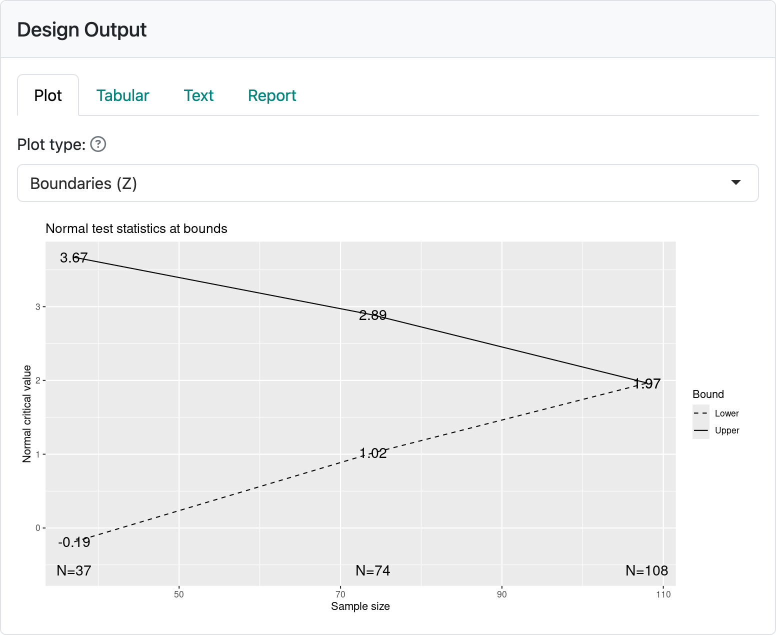
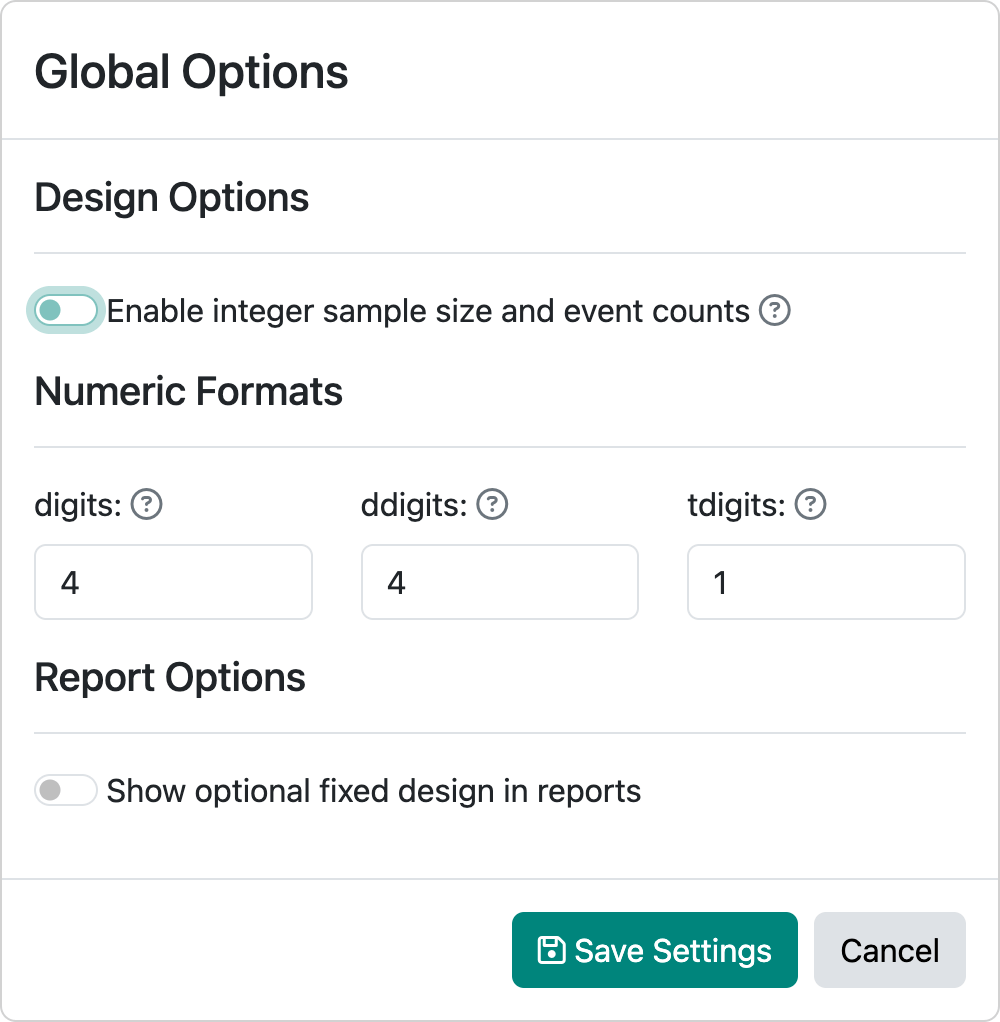
After selecting the “Plot” output tab, your output panel should now show the plot in Figure 2.9. This plot describes the timing and boundaries of the group sequential design you have just created. On the x-axis you can see that analyses are performed with sample sizes of 37, 74, and 108, respectively. Recall that the fixed design sample size was 100, so converting this to a group sequential design increased the sample size, in this case, by 8%. If you change the global options to toggle off “Enable integer sample size and event counts” (Figure 2.10) and set the fixed design sample size to 1, you will see the group sequential sample size is 1.06.
Whatever fixed design sample size you choose, the corresponding group sequential design with the given timing and boundaries will be 1.06 times the input sample size rounded up to an integer.
On the y-axis you see “Normal critical value”. The group sequential designs created using the web interface all use the multivariate normal distribution for computing design properties. This has been shown to be a good approximation for many cases. Another term for a normal critical value is a \(Z\)-statistic, a term which we will use interchangeably with normal critical value in this book. If you are familiar with \(Z\)-statistics, you may recall that a value of 1.96 corresponds to a \(p\)-value of 0.05 (5%), 2-sided or 0.025 (2.5%), 1-sided. At the final analysis we see a \(Z\)-statistic labeled as 1.9651, just slightly larger than this. Thus, if the trial proceeds to the final analysis, you will conclude that the experimental treatment is better than control if your final test statistic including all 108 patients enrolled is 1.9651 or greater. In technical terms, you reject the null hypothesis of no treatment benefit of experimental treatment compared to control. If \(Z < 1.9651\), you fail to reject the null hypothesis of no treatment difference between the treatment groups. You may reach a conclusion earlier than this final analysis, which is a major advantage of a group sequential design. For instance, at the analysis of 38 patients, if \(Z \geq 3.6692\) you can conclude that the new treatment is better than control at the first analysis. At this same analysis, if \(Z < -0.1878\) you might consider stopping the trial for futility.
2.3.2 Tabular summary of the design
Figure 2.11 shows a tabular summary of the design obtained by selecting the “Tabular” tab in the output panel. For each of the 2 interim analyses as well as the final analysis, timing information in the left-hand column (percent and number of patients to be included in the analysis). The 5 rows for each analysis show different characteristics of the efficacy and futility boundaries in the other columns.
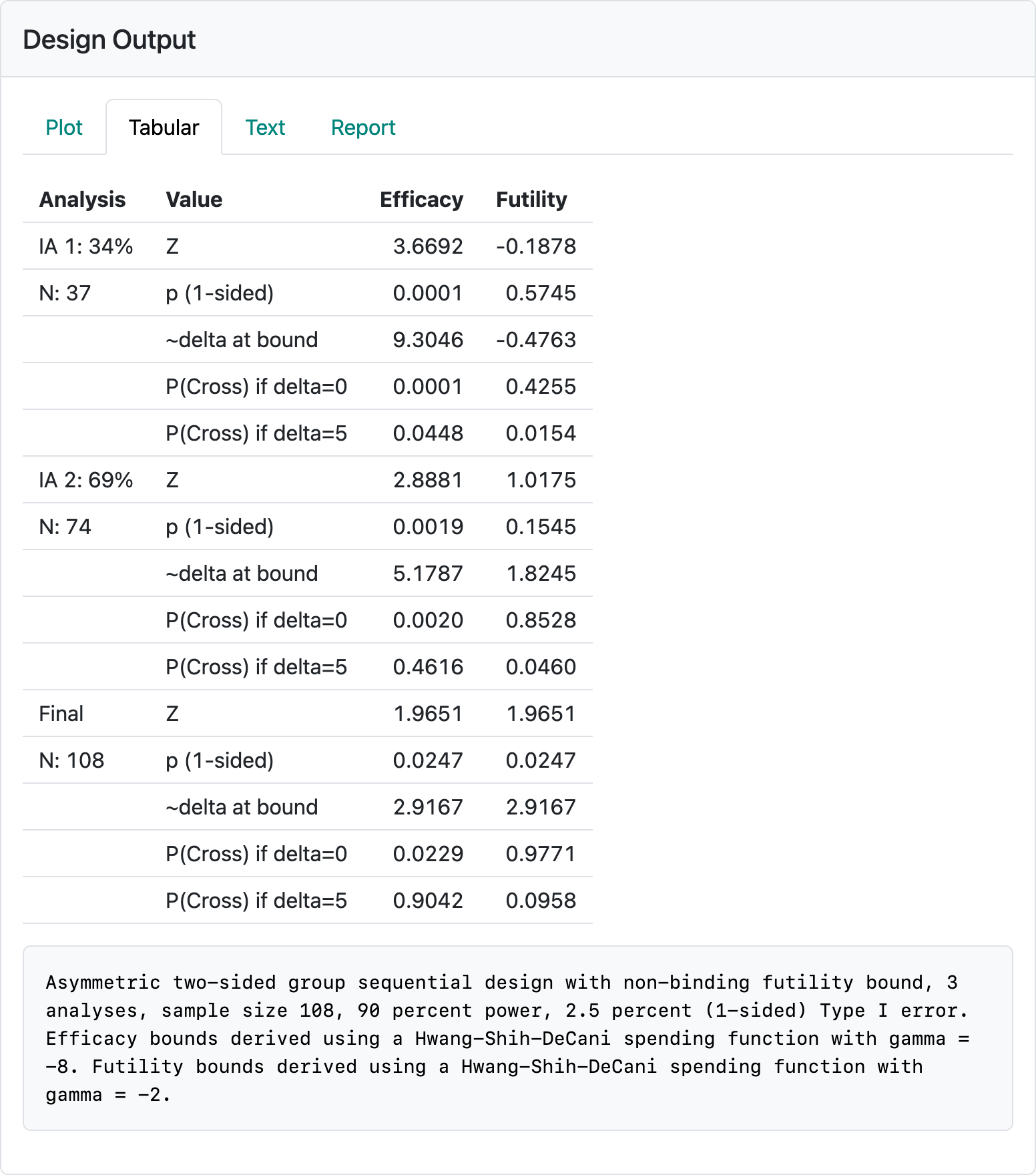
The \(Z\)-values (normal test statistic) required to cross the efficacy and futility bounds.
Nominal, one-sided \(p\)-values; greater \(Z\) implies smaller nominal \(p\)-values for both the efficacy and futility bounds.
“delta at bound” is an approximation of the observed treatment effect corresponding to the \(Z\)-value at each bound. This is also based on the “Treatment effect” you entered in the input panel; if you change 5 there to 50, you will see the treatment effect displayed here increase by a factor of 10. There is sometimes an expectation that in order to continue a trial past an interim analysis that there is an estimated treatment effect that is “promising”. Also, expectations may include that stopping early for efficacy would correspond to a clinically compelling estimated treatment effect. In this case, crossing an early efficacy bound would require nearly twice the treatment effect that the trial is powered for (9.3 vs. 5) at interim 1 and more than the powered treatment effect at interim 2 (5.2 vs 5).
The probability of crossing each bound under the null hypothesis (delta=0). These numbers are cumulative; i.e., the 0.0247 at the final analysis is the probability of crossing a futility bound at either of the interim analyses for the final analysis. The reason this is less than 0.025 (the study Type I error) is that the computation assumes the trial stops if the trial crosses a lower bound and cannot later cross an efficacy bound. Regulators generally prefer that you assume the trial will not stop if a futility bound is crossed and therefore an efficacy bound could later be crossed. This provides the sponsor of a trial the option of not obeying futility stopping rules and still controlling Type I error. If you change the “Testing” control in the “Boundaries” tab to “Asymmetric, binding”, this value will change to 0.025. You can see that there is a low probability of crossing an early efficacy bound at the interim analyses and most of the Type I error accumulates at the final analysis. The most important thing here is that there is often the expectation that there is a non-trivial probability of crossing a futility bound when delta=0 at an interim analysis.
The probability of crossing each bound under the alternate hypothesis. The most important information here is that there is a reasonably low probability of crossing the futility bound under the alternate hypothesis (\(\delta = 5\), in this case). For instance, there is only a chance of 0.0154 of crossing the first analysis futility bound if the true treatment effect is the hypothesized value of 5 (\(P(\text{Cross if} \ \delta = 5)\)).
Note the textual summary underneath the table that describes the study design. This describes the maximum sample size, Type I error and power as well as the types of bounds and spending functions used.
2.3.3 Text summary of the design
The “Text” tab provides much of the same information that is in the “Tabular” tab. However, there is additional information that we explain in more detail in Chapter 8 when we discuss spending functions.
2.3.4 The power plot
If you select “Power” as the plot type in the output panel, you get the plot in Figure 2.12.
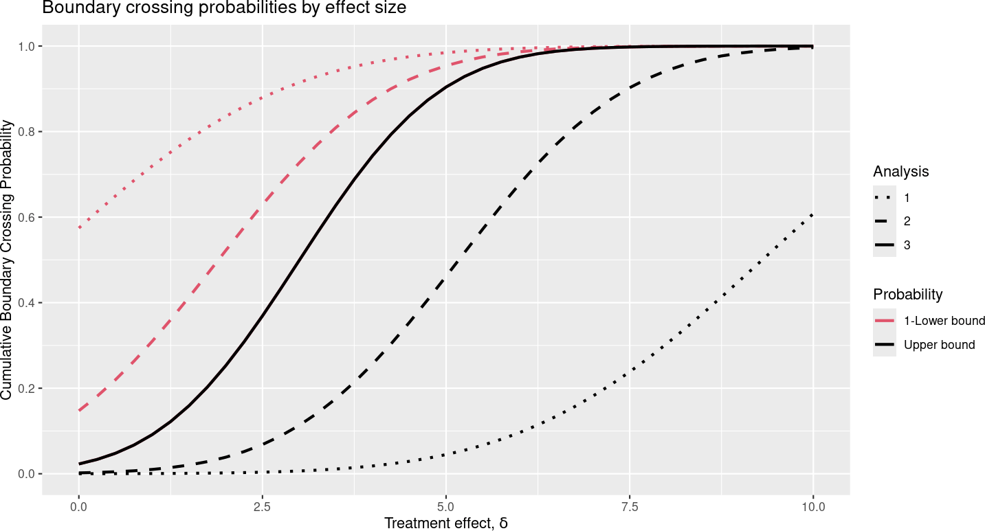
The x-axis shows the underlying treatment effect. The solid black line shows study power by the underlying treatment effect. Thus, for \(\delta = 5\) we have 90% power, as specified; this is indicated by y-axis value of 0.9 for cumulative boundary crossing probability. This power includes the probability of crossing at either an interim or the final analysis (cumulative probability) and excludes the probability of crossing the futility bound at one analysis followed by later crossing the efficacy bound. The dotted black line shows the probability of crossing the efficacy bound at the first interim analysis, while the dashed black line shows the probability of crossing an efficacy bound at either the first or second interim. The red lines correspond to 1 minus the probability of crossing the futility bound at interim 1 (dotted line) or at or before the second interim (dashed line). Thus, the lines at any given value of \(\delta\) divide the possible ultimate outcomes of the trial into six mutually exclusive probabilities according to which boundary is crossed first: cross the futility bound at 1) interim 1, 2) interim 2, 3) the final analysis, or cross the efficacy bound at the 4) interim 1, 5) interim 2, or 6) the final analysis. As \(\delta\) increases, we go from a relatively high probability of crossing a futility bound at an interim analysis to a high probability of crossing an efficacy bound either at an interim or at the final analysis.
2.3.5 The treatment effect plot
Selecting “Treatment effect” plot yields the display in Figure 2.13.
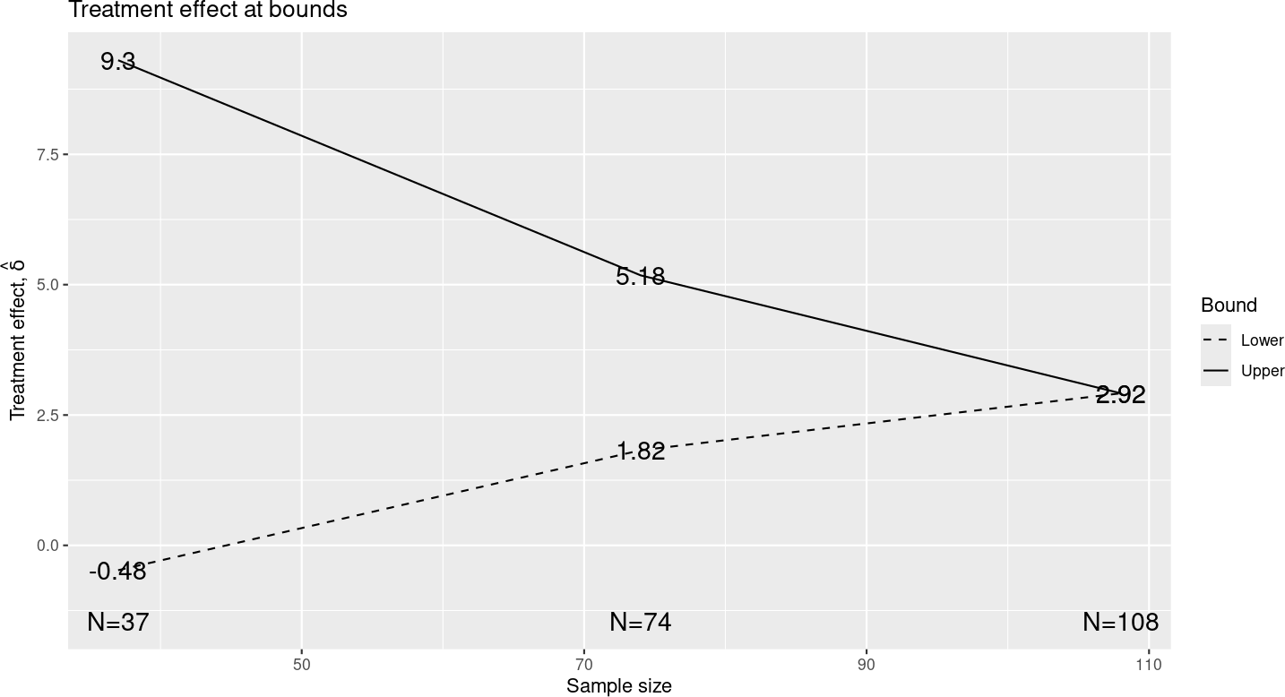
As noted in the discussion of the tabular summary, these treatment effects are approximations based on the \(Z\)-value at each bound and the treatment effect you specified. This is a nice way to review the “clinical significance” of crossing or not crossing any bound. Note that crossing the final efficacy bound corresponds approximately to an observed treatment effect of 2.92 as opposed the treatment effect of 5 that we powered the trial for. Checking this value may be a consideration in choosing the \(\delta\)-value you want to power the trial for.
2.3.6 The expected sample size plot
The “Expected sample size” plot in Figure 2.14 shows the average number of patients analyzed when the study crosses a bound at either an interim or the final analysis.
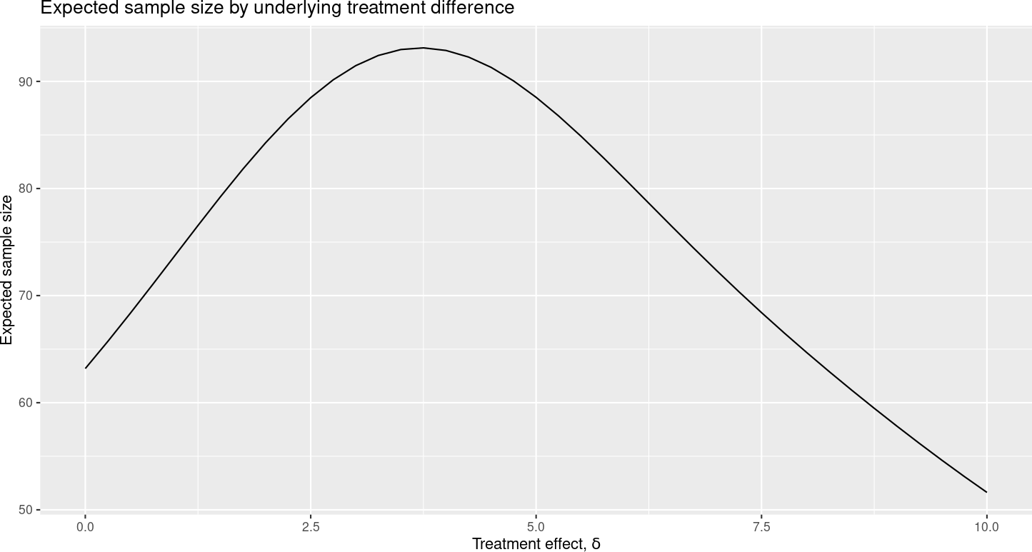
This expected sample size value is largest when the underlying treatment effect is between 2.5 and 5, and lower for more extreme values where it is more likely to cross a study bound at an interim analysis. Note that the expected value does not include patients enrolled but not included at the time an interim analysis is performed.
2.3.7 Reproducible reports
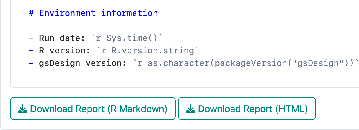
The “Report” tab allows you to produce a report summarizing your design in one of two ways. Hit the report tab and scroll to the bottom of the window to see the buttons in Figure 2.15.
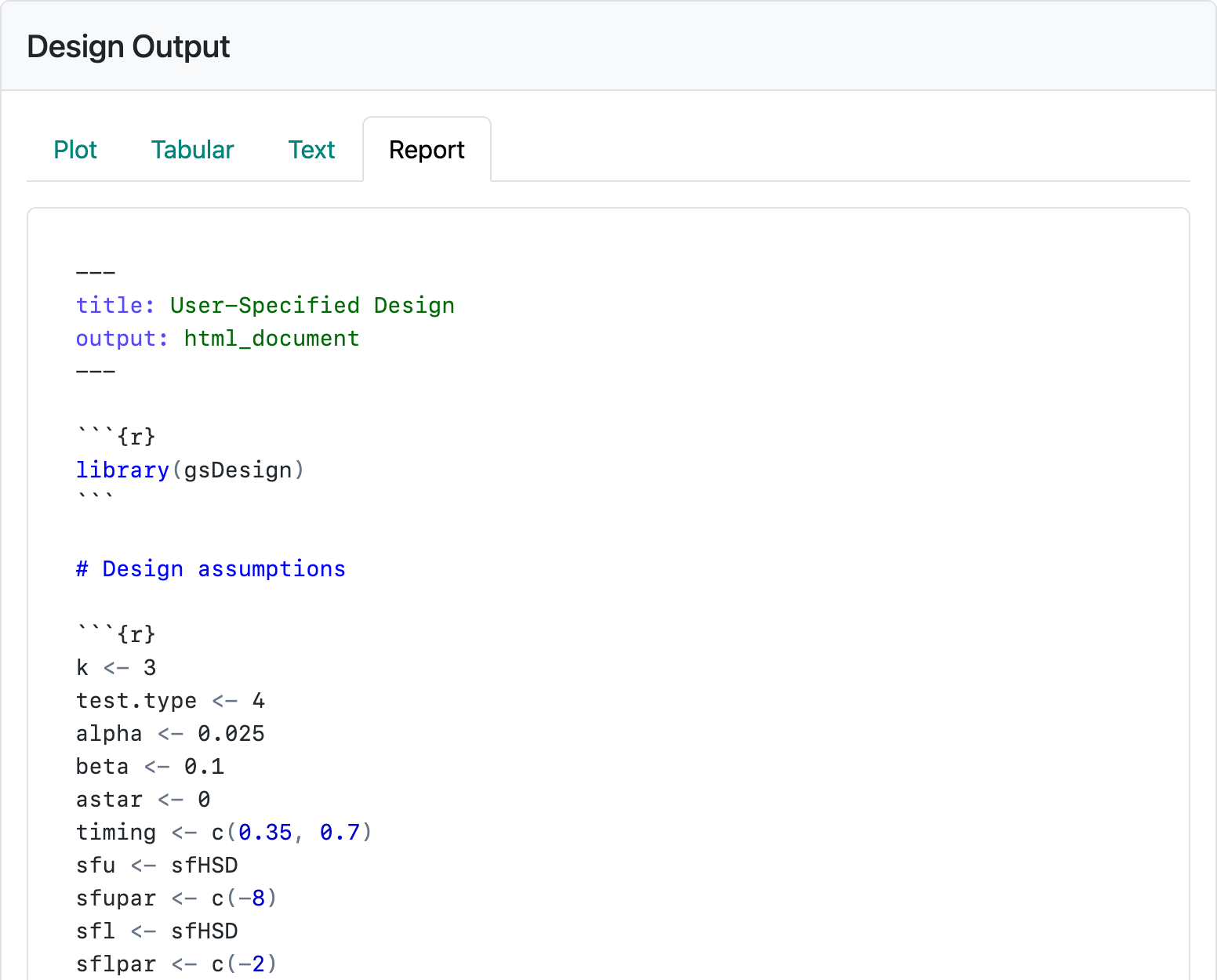
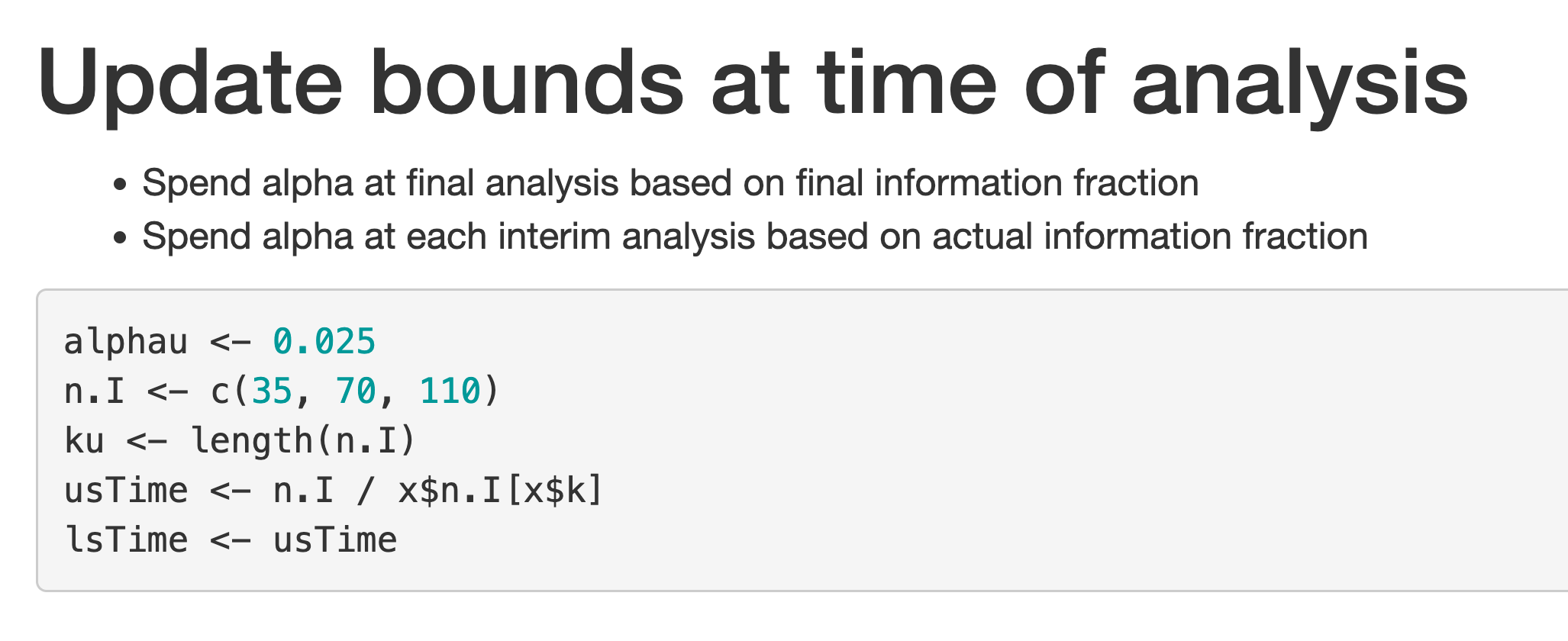
The first button will download an R Markdown file with a mixture of text and code that can be opened from the RStudio IDE to render an HTML report. This source file enables you to add text and further code, as needed, to fully explain the design to an intended audience or just for documenting for your future self what you were thinking about when you created the design. If you are running R on a server, you may have the gsDesign package needed to publish the saved report already installed. If not, you can install the R package gsDesign from CRAN. Figure 2.16 shows the first part of the code generated for the current design. The R code chunk you will see in the interface after scrolling down beginning with x <- generates the design and saves it in a variable named x. The “plot” command generates whichever plot you have selected from the “Plot” tab, while gsBoundSummary() and cat(summary(x)) provide the tabular and textual summaries you have seen.
The second button creates an HTML file by running the R Markdown report and downloading for you. Pushing either of these buttons enables you review and copy R code, so you can use in R as you please.
2.4 Saving and restoring your design
Sometimes, we want to continue our previous work in the web interface without setting up all the design parameters again. Fortunately, there is a feature for saving and restoring your design. The buttons in Figure 2.17 enable you to save, restore, and report your work.

You can save the design by pressing the “Save Design” button in the upper-right corner. Give the saved design file a name and download the file. This step will capture the current state of the entire web interface (including all inputs) and store it in an .rds file (serialized R objects). You can then restore the saved design from the .rds file by uploading it using the “Restore Design” button. The .rds files offer an efficient way for the persistent storage, transfer, and exchange of design checkpoints, enabling a reproducible and productive workflow when using the web interface.
2.5 The Update tab
The update tab allows you to update study bounds at the time of interim analysis based on differences from planned versus actual event counts for studies with a time-to-event endpoint or differences in planned versus actual sample size or statistical information for other endpoints. We continue with the first design example to demonstrate. If you do not have the first design example still available on your screen, you can download first-design.rds, press the “Restore Design” button in the upper-right corner of the interface to restore the design. Then, switch to the “Update” tab in middle of the top row of the interface, and you should see the screen in Figure 2.18.
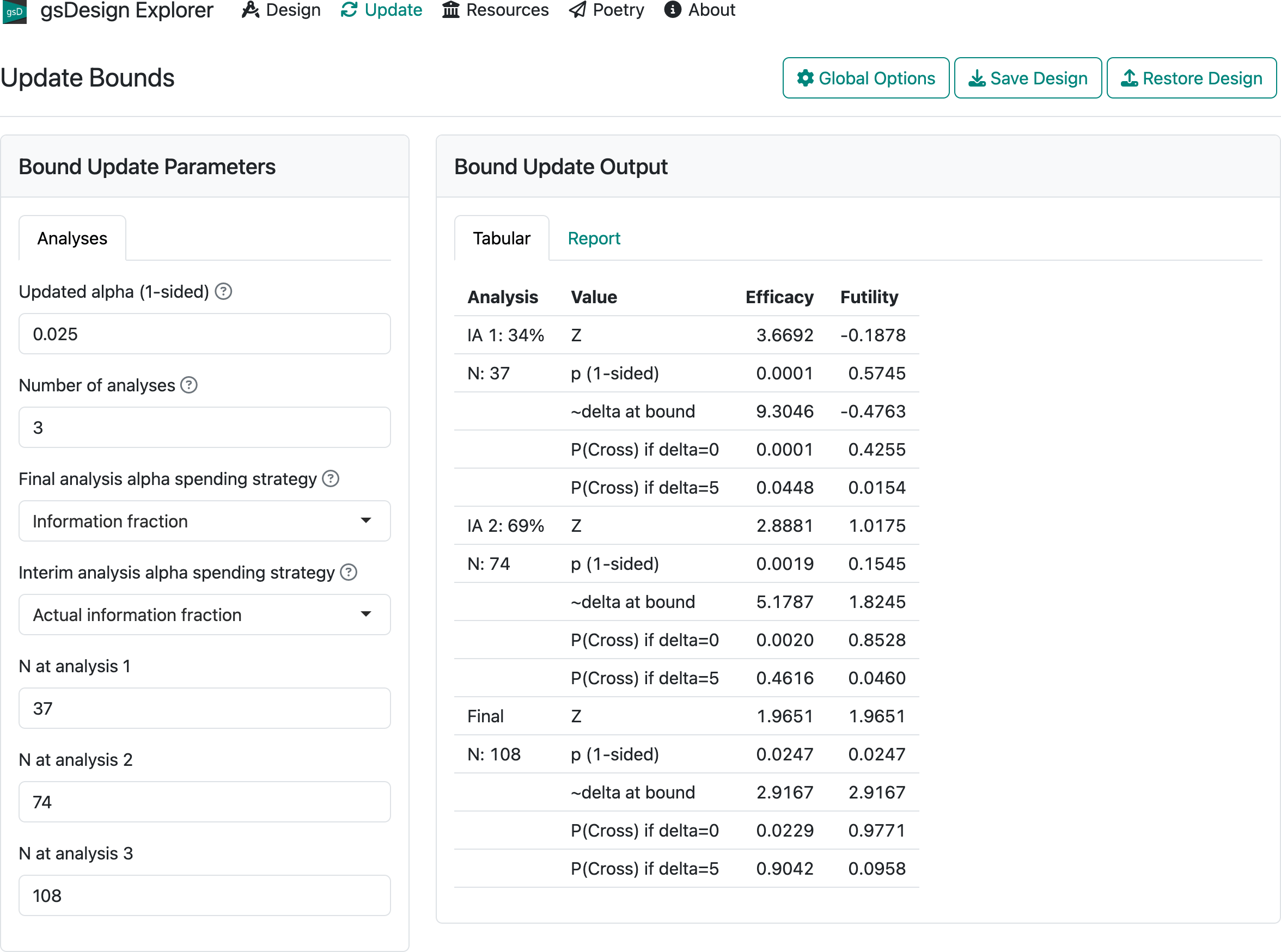
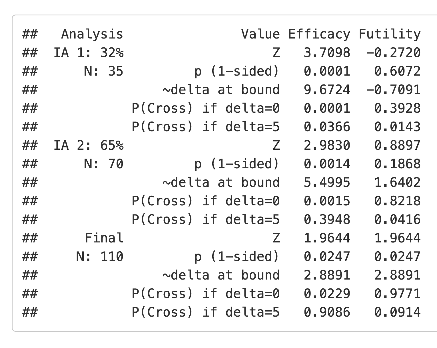
For the 3 analyses, enter 35, 70, and 110 in the boxes labelled “N at analysis 1, 2, 3”. Now switch to the “Report” tab and, at the bottom of the screen, press the “Download Report (HTML)” button. If you open the resulting HTML file in your browser and scroll down, you will come to Figure 2.19.
If you come to the end of the trial and your data cutoff left you with less than the final planned sample size, the first bullet indicates that you would not spend the full \(\alpha\) for testing; to avoid this, you can change the “Final analysis alpha spending strategy” strategy to “Full alpha”. This should be pre-specified explicitly in a protocol. If you have more than the final planned sample size at the final analysis, it does not matter which option you choose for this. The “Interim analysis alpha spending strategy” control says that you will use the information fraction for spending at the interim analysis. The other option will be discussed later when we present further examples.
Finally, we look at the updated bounds displayed on the screen (Figure 2.20). These are derived following the methods of Lan and DeMets (1983).
2.6 The Resources and About tabs
As of this writing, the “Resources” tab contains videos summarizing how to use this web interface. The first one is a useful 10-minute summary for getting started with the interface.
2.7 Summary
The output summaries shown in this chapter are likely the ones that you will find most useful. We will demonstrate other options in later chapters where additional issues are addressed. You now have a basic understanding of many of the input and output controls. We proceed to working with different endpoint types in the next chapters.